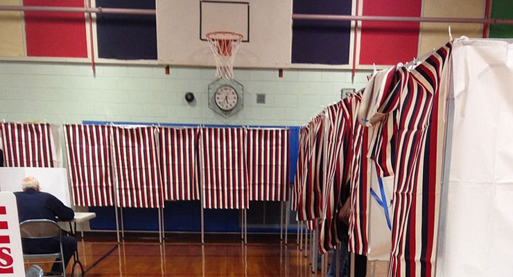
The latest comes from an article at the Miami Herald by Caitlin Ostroff and David Smiley:
Michele Myers did a double take. Pen down, having finished marking her nine-page ballot, she skimmed the printed list of candidates she planned to vote for. All had been checked off — except for the U.S. House and Senate. “How could I have missed that?” the 44-year-old wondered, looking at her District 22 ballot for Coral Springs.
She flipped back to the front, finding the two races tucked away underneath the ballot instructions on the first page. She thought nothing of it until she saw a headline in the Orlando Sentinel: “Could Broward ballot design have cost Florida’s Senate race 24,000 votes? I guess it didn’t occur to me that other people wouldn’t catch [their] mistake,” Myers said. “Why bother going if you don’t know who you’re going to vote for?”
More on this story is found here. Absolutely recommended as well is this guide for designing ballots putting together by the Center for Civic Design. Tips include things like using big enough type and using clear and simple language. The information contained in the guide comes from research conducted by the American Institute of Graphic Arts’ Design for Democracy Project that was paid for by the U.S. federal government’s Election Assistance Commission (EAC). Briefly, they describe the guides as:
There have been excellent ballot design guidelines around since mid-2007 when the U.S. Election Assistance Commission published AIGA Design For Democracy’s work in its report, Effective Designs for the Administration of Federal Elections. Everyone involved in that project quickly figured out that, as juicy as the design specs were in that report, they needed to be boiled down to essentials that local election officials could easily act on within the constraints they had. Field Guides To Ensuring Voter Intent were inspired by that need.
Leave a Reply