There are maps that show the impact of World War II on Jewish populations across Europe. There are also some, not as many, maps that show the scale of the impact of the expulsion of Jews from Arab lands. But as far as I can tell, there is no map that shows the geographic extent of the exodus of Jewish people in the 20th Century. I decided it couldn’t be too hard to make my own.
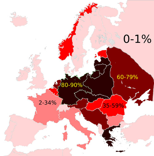
To start with, I knew that Wikipedia users had created the following map of the death toll as a percentage of the total pre-war Jewish population by country. The map is based on information provided by the impressive Philip Gavin, founder of the History Place, as well as research by the Center for Holocaust and Genocide Studies at the University of Minnesota. I followed the basic template of this Wikipedia map for my new map. This is the original Wikipedia Map of the Holocaust death toll as a percentage of the total pre-war Jewish population by country:
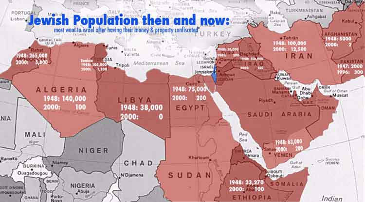
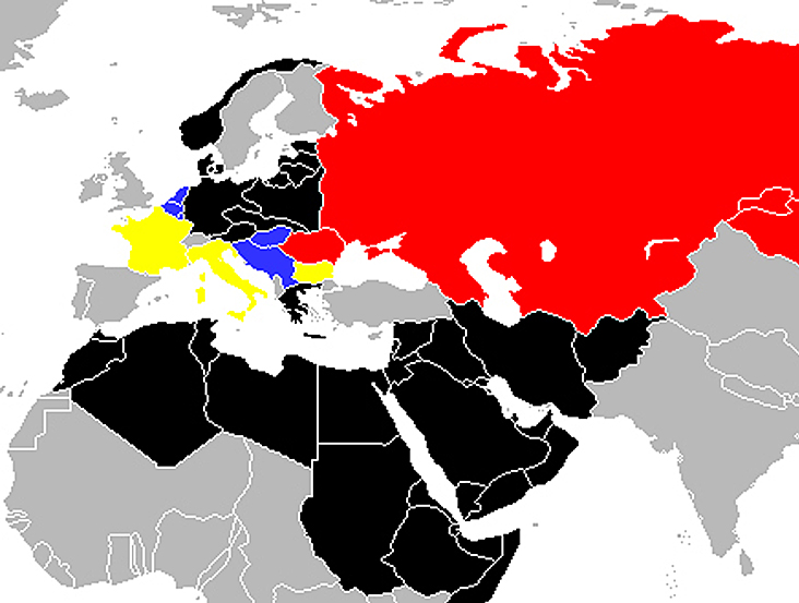
I also found the following map showing the exodus of Jewish populations across the Middle East. Notice every one of the countries highlighted red had a drop in Jewish population of over 99% except Iran with only a 90% drop.
So here is my map. It is color-coded to reflect the percentage of the Jewish population that were lost after the series of genocides and expulsions of the 20th century. I used a blank world map from Wikipedia with national borders as they were in 1935 as a base for my Photoshop work. Take a look:
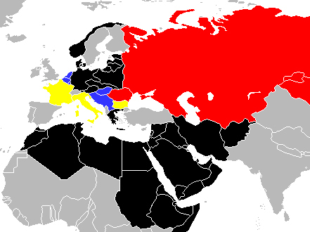
A blow up of this map is below. Notice that all of the areas color coded grey on the map are areas that, other than Turkey and perhaps England, had almost no large populations of Jews throughout recorded history or at the start of the 20th century. The majority of these countries color coded grey also resisted allowing Jewish refugees from the Holocaust or from the Jewish exodus from Arab and Muslim countries.
I also added some of my own basic research to back up some of the map’s country color rankings. The Jewish Virtual Library has a chart of Holocaust victims by country based on information from the Anti-Defamation League and a similar chart can be found at the Anne Frank Foundation.
Unlike in the original Wikipedia chart at the top of the article however, I wanted to reflect total reduction in Jewish population, not just death rates. Inside Denmark for example, colored black on my map, the Jews mostly survived but fled into Sweden. This still represented a complete collapse in the number of Jews living in Denmark.
Some of the design of the map could stand to be explained a bit especially because I’ve never created anything like this map before.
In general, the drop in Europe’s Jewish population by and large took place in the few years of the Holocaust and this is what the color code is reflecting. But my map shows drops in population from the early 20th century to the end. For example, Russia is a complicated situation:
The parts of Russia overrun by the Nazis in their invasion were purged of Jews to the fullest extent. This obviously included any Russian territory up the gates of Leningrad, Moscow and Stalingrad – the cities marking the furthest advances of the Nazi armies. The original Wikipedia map at the beginning of this article illustrates what happened very well, showing correctly that almost no Jews were killed during the Holocaust in areas of Russia the Nazis did not overrun.
My new map includes however the rest of the 20th century. Following the war, Stalin began a series of anti semitic campaigns including the Night of the Murdered Poets and the Doctors’ Plot allegation. Beginning in the 1970s, mass emigration of the Jewish population began a decline that lasted through the end of the 20th century. This entire decline is reflected in Russia being colored red on the map that correlates to roughly 60-80% of the Jewish population being killed or leaving Russia during the 20th century.
My thoughts on the map and its meaning
I didn’t intend to make this map to give evidence in support of the creation of modern Israel in 1948. And I also don’t present the map in the hope of excusing the actions of Israel or especially excusing the current desperate condition of the Palestinian people. But what happened to the Jewish people during the 20th century was on a global scale. This wasn’t a small effort and it was pretty close to completed.
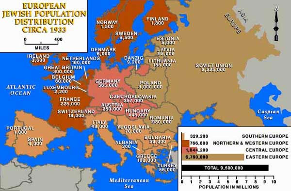
At the beginning of the 20th century, the Jewish people were spread across Europe, the Middle East and North Africa. According to research by the Jewish Publication Society, the world’s Jewish population in 1939 was 16.6 million. Almost 60 percent, about 9.5 million, lived in Europe, and you can get an idea of their distribution within Europe in 1933 with this map here:
It is also worth noting that Jews still aren’t really welcome in most places they were expelled from. My own history, a mix of Polish Jews and Iraqi Jews, illustrates this point. There are basically no Jews left in Poland or Iraq. We are not really welcome in the current Polish political climate and would put our lives at serious risk to travel openly as Jews in Iraq.
In the end, I have personally found, when trying to wrap my head around the Israel-Palestine conflict, that conceptually understanding how broad the genocide and exodus of the Jewish people was, can help bring even the most ardent opponents of modern Israel a fresh understanding of the origins of the state. I hope this map will assist in giving a broader understanding of the region and its recent past.
Minor edits 2/7/18
David Anderson, J.D. says
Excellent article. Without ignoring or cheapening the tragedies of the Palestinian people at the hands of Israelis and also (but rarely reported) “brotherly” Arab governments, a full understanding of Isr/Pal’n issue can’t be appreciated without some background in the history of Jews in the West Asia/Africa/Europe throughout the 20C.
And not just the Holocaust, but a larger, more global “2nd Exodus” from dozens of countries Jews had lived in for as long as Arabs have lived in Pal/Israel.
There can be no compromise or peace without a holistic understanding of all parties’ respective histories.
The maps are a quick and graphic tools for this. Well done.
David
NYC
Dyan says
850,000 Jews were ethnically cleansed from Middle Eastern Arab countries following 1948 while 750,000 Arabs were expelled or fled “Mandate Palestine.” Today, there are 20,000 Jews living in the Middle Eastern countries outside of of Israel while there are 2 million Arabs living in Israel proper with citizenship. The truth is in the pudding. There are 0 Jews living in some Palestinian Arab territories because they would simply be murdered.
Dyan says
850,000 Jews were ethnically cleansed from Middle Eastern Arab countries following 1948 while 750,000 Arabs were expelled or fled “Mandate Palestine.” Today, there are 20,000 Jews living in the Middle Eastern countries outside of of Israel while there are 2 million Arabs living in Israel proper with citizenship. There are 0 Jews living in some Palestinian Arab territories because they would simply be murdered. It’s very easy to see which side is tolerant and which isn’t. The truth is in the pudding.