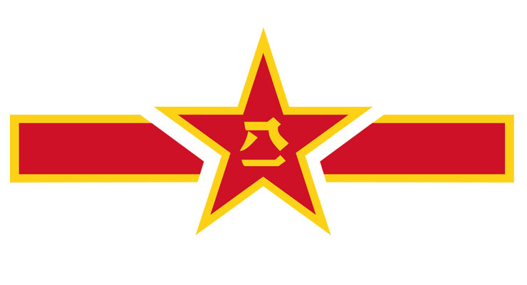
Most people can recognize a roundel when they see one, but they don’t know it is called that, and they may not know how this form of national graphic art works. Military buffs and vexillologists (flag fanciers) know though. Such folks, usually men, are surprisingly common so let’s peek into their world with a look at the roundel.
If you see a military plane or helicopter on TV, or see one bombing your country, please note that on the back of the fuselage, tail, or wings, is the circular version of that air forces’ national flag: the roundel.
The concept originates from heraldry, the art of an organization’s emblem or coat of arms. Heraldry has a rich thousand year old history, a complicated vocabulary, and all sorts of rules, schools, and traditions. Originally emblems represented armies and nation states, think the covers of passports today, and have evolved into corporate brands and trademarks.
The roundel is a recent descendant of the above. Since the advent of military airplanes a century ago, a neat, national flag-based symbol came into being which had to be clearly visible on the fly and at a distance. Any country with an air force has roundels, even those who don’t own planes, and from a design and political perspective they’re fun. This study covers the most interesting examples.
Start here at home. The US Air Force changes its visual posture slightly every few decades; uniforms, camouflage, and roundel which currently appears as:

Many roundels are easily identifiable if one knows the flag of the country, such as Japan’s based on their rising sun:
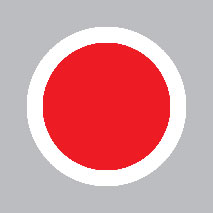
or Canada’s maple leaf:

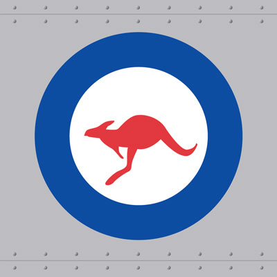
Standard issue tri-color flag based roundels are common, but others are a bit more creative. Witness the Royal Australian Air Force’s kangaroo:
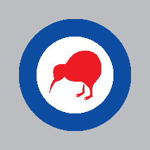
Or the Royal New Zealand Air Force’s cute little kiwi:
Israeli jets, no strangers to the skies above Gaza or Lebanon, sport a predictable but visually effective Star of David. The solid star, as opposed to the usual “hollow” design is perhaps more muscular and aggressive, befitting an air force:

As in aeronautics, Lebanon’s military graphic designers can’t come close with their lackluster logo:
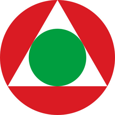
Abkhazia is a tiny almost un-recognized Russian vassal state consisting of a seaside strip of the Republic of Georgia. Abkhazia has a very modest air force, but they can still afford a pretty roundel:

Not all roundels are round. Botswana’s has a triangle of blue for the sky plus black and white for racial unity, as per their flag:
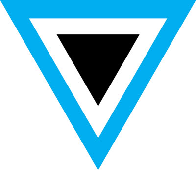
Their air force itself is less inspiring: a Presidential Gulfstream, some helicopters, and millions of mosquitos. Perhaps Estonia copied Botswana’s design?

Estonian people are nearly all white, so their roundel is less about inter-racial harmony: Estonia’s represents the blue sky, again, the black earth, and their white is for purity. Luckily, these two are not countries close enough, or hostile enough for a confusing air war against each other: “Which plane is who’s?”
Plagiarism is common. Witness El Salvador:

Argentina:
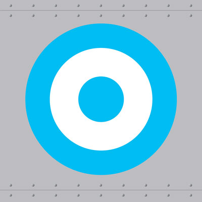
and also Greece:

Again, these are not countries close or hostile enough to turn up wearing the same decals to the same war, though it might be embarrassing at international air shows. Like two women with the same dress at a party. Visual appeal is important on military planes and some countries do it better than others. The Bahamian Air Force’s contribution to aviation art is typically pleasant and breezy, like a fly-over at the beach:

One would almost want to be bombed by such beautifully decorated jets as Kyrgyzstan’s:

or Macedonia’s:
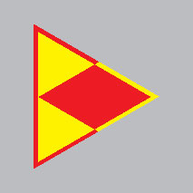
Similarly attractive, Qatar’s, which sports its unique national maroon color (Pantone 222c, some call it a “red”). It’s a color which is very difficult to print: the Qataris love their little jokes:

For awards, “Most Aggressive Roundel” has to go to Uganda although their modest air force doesn’t quite live up to its fantastically savage looking roundel. The grey crowned crane, Uganda’s national bird, is almost saying “That’s all, folks!” – appropriate for a bombing run:
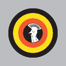
Not all roundels are beautiful or frightening, however. Bangladesh breaks the cardinal rule of graphic design in both its flag and its roundel:

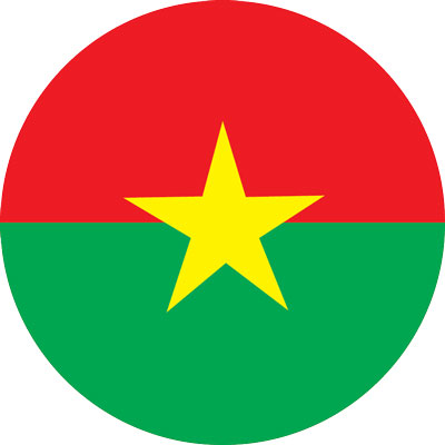
The human eye can’t focus on red and dark blue or green simultaneously: the intersection of those colors seem to vibrate slightly. So not only are their jets flying overhead at hundreds of miles an hour, the colors on those planes are actually vibrating next to each other: terrifying! Burkina Faso in Africa also:
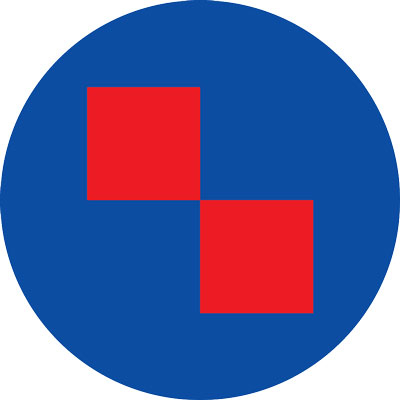
Croatia’s breaks the rules as well, committing the red-blue felony:
Although roundels are exclusively for military planes, in the non-military aviation sphere many airline logos visually refer to the military roundel, such as Japan Airlines, Turkish, and the old classic, Pan Am:



Sources
- https://www.aircraft-insignia.com/index.htm
- https://www.infohow.org/wp-content/uploads/2012/11/Air-Force-Roundels.jpg
- https://en.wikipedia.org/wiki/Roundel
Leave a Reply