Tropical countries don’t like how Mercator world maps magnify everything except for the tropics. Recently, many have endorsed the Equal-Earth (EE) map-projection, to replace Mercator, because they don’t like how Mercator magnifies everything except for the tropics. My thoughts on this are as follows.
Equal-area maps avoid the fault by showing every country, continent and region with their with their areas on the map in the same proportions as their areas on the Earth. Such equal-Area maps have been around for a long time, at least back to the 1400s or 1500s, and maybe much earlier, and were used in atlases at least as far back as the 1500s.
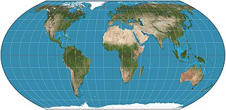
In 1805, German mathematician Karl Mollweide introduced an elliptical equal-area world-map that became immensely popular. Mollweide didn’t publicize it, and its big popularity began when Jacques Babinet, publicized it in France in 1857. It was then very widely used in atlases and classrooms for about 130 years, maybe longer in some countries.
Other equal-area maps were added in subsequent years in the 19th and 20th centuries, but Mollweide remained immensely popular. For example it was on the wall in my classroom when I was young.
Maybe around the late 1980s, there began a fashion among cartographers, for “compromise maps” – maps that are neither equal-area nor “conformal” (local-shape and layout preserving).
Even when equal-area maps were widely-used, few people had heard of them, until Arno Peters, a German historian and publicist, in the 1980s, re-invented and re-proposed an 1855 equal-area cylindrical map called Gall Orthographic.
Peters, and many others, thought that it was Peters’ invention and that it was the first equal-area map. It was then named “The Peters Projection”. It became very popular, adopted by various international aid-organizations, church organizations and U.N. agencies. Later it got the name “Gall-Peters” (GP).
But GP heavily, drastically, distorts shapes on most of the Earth. Many call it ugly, with justification.
It makes Africa and South America look as if they were made of wax and someone forgot to turn the air-conditioner on. A cartographer said that it makes those two continents look like tattered long-underwear hung out to dry.
This was outrageously unfair to the beautiful elliptical Mollweide, which had 130 years of huge popularity.
Cartographers were furious because Peters made various mis-statements and mistaken claims about ‘his’ map. Also, they were likely jealous because Peters upstaged them by bringing equal-area to international attention.
So some cartographers wanted a belated counter-proposal. It was pointed out that it should be new (or at least billed as new) so that it could be hyped and get big attention as a new invention. The cartographers were obviously shamelessly taking a leaf from Peters’ book.
Could the motive of self-glorification have entered in?
Flat-pole hybrid maps were also popular with cartographers. Someone cynical could suggest that this was because they offer endless scope for new variations of the same old thing.
All of the maps mentioned so far are “pseudocylindrical”, meaning that their parallels are parallel straight lines, with each parallel having constant scale.
Flat pole hybrids (FPH) represent the poles as straight-lines (though they’re really points), and have curved meridians (and therefore curved sides).
So the cartographers made-up a flat-pole hybrid as their counterproposal. They decided that it would be a blend of two old familiar FPHs, one of which was part of the first FPH proposal in 1906.
Someone wrote a program to blend the two maps and someone else slid an old-fashioned slider to choose the blend that he liked, one that he liked because it resembles the Robinson Projection.
And thereby they “invented” their new 1906 map :-)
They call their old 1906 invention “the Equal Earth projection” (EE). Unsurprisingly, many articles speak of it as if its inventors have just invented equal-area.
EE’s “inventors” claim that the 1805 Mollweide projection isn’t good enough because of its distortion at its periphery. Of course all of the articles just uncritically quote their “press release”. EE is billed as a new invention, and as the optimal world-map invented by ‘the scientists’.
Of course that’s all bullshit. EE is just one more, of many nearly-identical flat-pole hybrid pseudocylindrical equal-area maps and just one more variation of something that was introduced in 1906. Those guys didn’t invent anything.
As for Mollweide’s peripheral-distortion, it’s only insignificantly more than EE’s distortion in the same regions. In particular, with Greenwich-centering, the most peripheral continental land is at longitudes east and west 120.
At longitude 120, at the thickly-populated latitude 30, Mollweide’s point-min-scale is only about 14% less than that of ER. Its point-min/max-scale is only about 19% less. And, at that position, Mollweide’s point-min-scale is about 0.8. That is, at that point, Mollweide’s smallest scale is about 80% of the scale on a globe with the same equator-length as the map.
Point-min-scale at a point the smallest scale there, divided by the scale on a globe with the same equator-length as the map.
Point-min/max scale is the min scale there, divided by the max scale there.
Those measure scale-loss and shape-distortion—the two problems of equal-area maps.
120 west, 30 north is near San Diego & Los Angeles. So Mollweide isn’t significantly worse at peripheral longitude than EE.
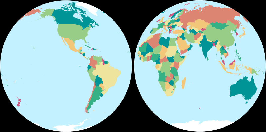
But EE distorts Africa’s shape a lot worse than Mollweide does and EE’s drastically-unrealistic line-poles result in drastically-compressed high-lat parallels, in addition to the tropical shape-distortion.
Mollweide is elliptical and many regard it as the most realistic of the equal-area maps – and the most beautiful. Many say that Mollweide should be the replacement for Gall-Peters.
EE amounts to an effort for a few people to claim inventorship for something claimed to be scientifically-optimal. Bullshit.
Do the flat-pole hybrids have any justification? Yes, if one insists on a one-piece map, the hybrids distribute distortion most equitably. But what good is “one-piece”, when that one-piece is unrealistic and ugly?
It is objectively ugly because:
- The gross unrealism of its line-pole is, of itself, ugly.
- The map’s shape looks nothing like a planet. It looks more like a seat-cushion.
- Representing the poles as lines requires big north-south scale-distortion. East-west flattening in the tropics, and north-south flattening in the far north and south.
- As a consequence, EE puts huge shape-distortion in the center of the map. That’s exactly where there ISN’T distortion on a photo of a globe or planet. We don’t expect gross distortion at the center, and so it’s particularly ugly and unrealistic.
I remind everyone that the whole point of equal-area was fairness to the tropics. How can EE’s gross distortion of Africa be called ”fair”?
For equitable distribution of distortion, 2-piece Mollweide beats EE, while retaining Mollweide’s realism & beauty. (2-piece Mollweide consists of two side-by-side circular half-world maps)
Don’t let the hype and bullshit convince you that Equal-Earth is the best, or is a scientific optimization, or that there’s anything new about it. No other equal-area world map matches Mollweide’s realism & beauty.
Leave a Reply